Kaffe Fassett
Posted: February 25, 2011 Filed under: quilts Leave a commentKaffe Fassett is a British textile artist who designs fabric and does quilting, knitting, needlepoint, and mosaic. He does a lot of BOLD prints in BOLD colors!
Color coding
Posted: February 25, 2011 Filed under: quilts Leave a commentHow awesome are color coded files and office systems??
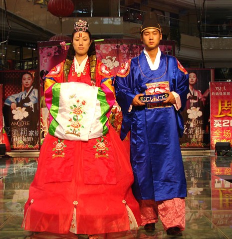
Korean colors
Posted: February 25, 2011 Filed under: quilts Leave a commentMaybe there’s a reason I’m drawn to saturated colors!
Traditional Korean wedding dress:
Traditional Korean fan dance:
Columbia’s color palette
Posted: February 23, 2011 Filed under: quilts Leave a commentIn case you were wondering – Columbia’s approved color palette is online and consists of:
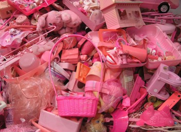
Pink and blue
Posted: February 23, 2011 Filed under: quilts Leave a commentThe strict boundaries of gender as enforced by color – an exhibit at Mass MoCA called Color Forms. These works are by Portia Munson.
colourlovers.com
Posted: February 21, 2011 Filed under: quilts Leave a commentRayshawn just told me about this site – like Adobe Kuler you can create your own palette of colors, but there’s more “community” type stuff.
Adobe Kuler
Posted: February 16, 2011 Filed under: quilts Leave a commentAnd, thanks to Alice for telling me about this – Adobe has a web application called Kuler where you can create color combinations. Click here to see it. You can set what kind of relationship you want between a set of five colors – complementary, triad, etc – and then spin around a wheel to see what happens. Very cool!
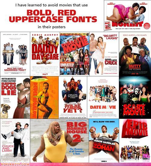
Movie poster colors
Posted: February 16, 2011 Filed under: quilts Leave a commentThanks to Eduardo for sending me these links – check it out!
(1) The abundance of movie posters that use blue/orange contrast. Of course, now we know from class that it’s a COMPLEMENTARY contrast, thank you Mr. Itten. It is funny though, isn’t it, how many there are?
 http://www.slashfilm.com/orangeblue-contrast-in-movie-posters/
(2) The use of big red fonts for terrible movies.
ha!
Desaturated colors
Posted: February 13, 2011 Filed under: quilts Leave a commentI am not a natural fan of desaturated colors, colors that are dull and boring and recede into the background. I like bright vibrant colors that stand out. However, I think I should try to be more open-minded and at least be able to see their uses, and thus expand my repertoire. So on my ever-long list of quilting projects to try out, I have a project to try to use desaturated colors. Here are some examples of desaturated colors:
Anni Albers was part of the Bauhaus school, met and married Josef Albers, came to the U.S. with him, and is probably the most well known 20th century textile artist.
 Southeast Trails, Carrie Gundersdorf 2007
 I cheated – aren’t those bright pops of orange and turquoise nice? But I guess they’re as nice as they are precisely because of the desaturated colors around them.


